TranScape VR
in cooperation with Anda Iosip, Center for Computational Biology, Julius-Maximilians University Würzburg)
Awarded GOLD (Distinction) at the IIID Award 2023 for Information Design
Nowadays RNA-seq is the norm for investigating transcriptome-wide gene expression. These data cover the expression of thousands of genes over many different tissues and conditions. Finding the biological story hidden in this massive amount of data is challenging and standard data analysis methods using 2D, non-interactive visualization are limiting and daunting. To upgrade to state-of-the-art technology, we developed TranScape VR, a new tool for visualizing transcriptomic landscapes in an immersive, explorative, holistic and entertaining Virtual Reality (VR) space.
Data: We use publicly available data of seven different organs and tissues of the Venus flytrap (Dionaea muscipula), a deadly carnivorous plant (see Iosip AL, Böhm J, Scherzer S, Al-Rasheid KAS, Dreyer I, Schultz J, et al. 2020: PLoS Biol 18(12), doi:10.1371/journal.pbio.3000964)
Concept
In search for special plant carnivory-related genes, we represent transcriptomic data as an interactive network, mapping genes to each tissue core-node, forming gene clusters. Biological parameters (e.g, gene expression level, tissue specificity) are mapped to visual parameters such as colour, size, distance, and gene position within the 3D space. The visualization offers different modes which depict different properties of the data set. All modes can be interactively explored in order to form and test hypothesis in real-time.
Genes are represented by points in 3D space. Positions are defined by the sum of each tissue vector that hosts the gene, weighted by the inverse of the specificity. The tissue specificity of a gene is determined using the Shannon Entropy method (see Iosip et al 2020 or Schug J. et al. 2005). It is measured by the Q-value. A very small Q-value indicates a very high specificity level and vice versa.
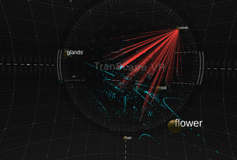
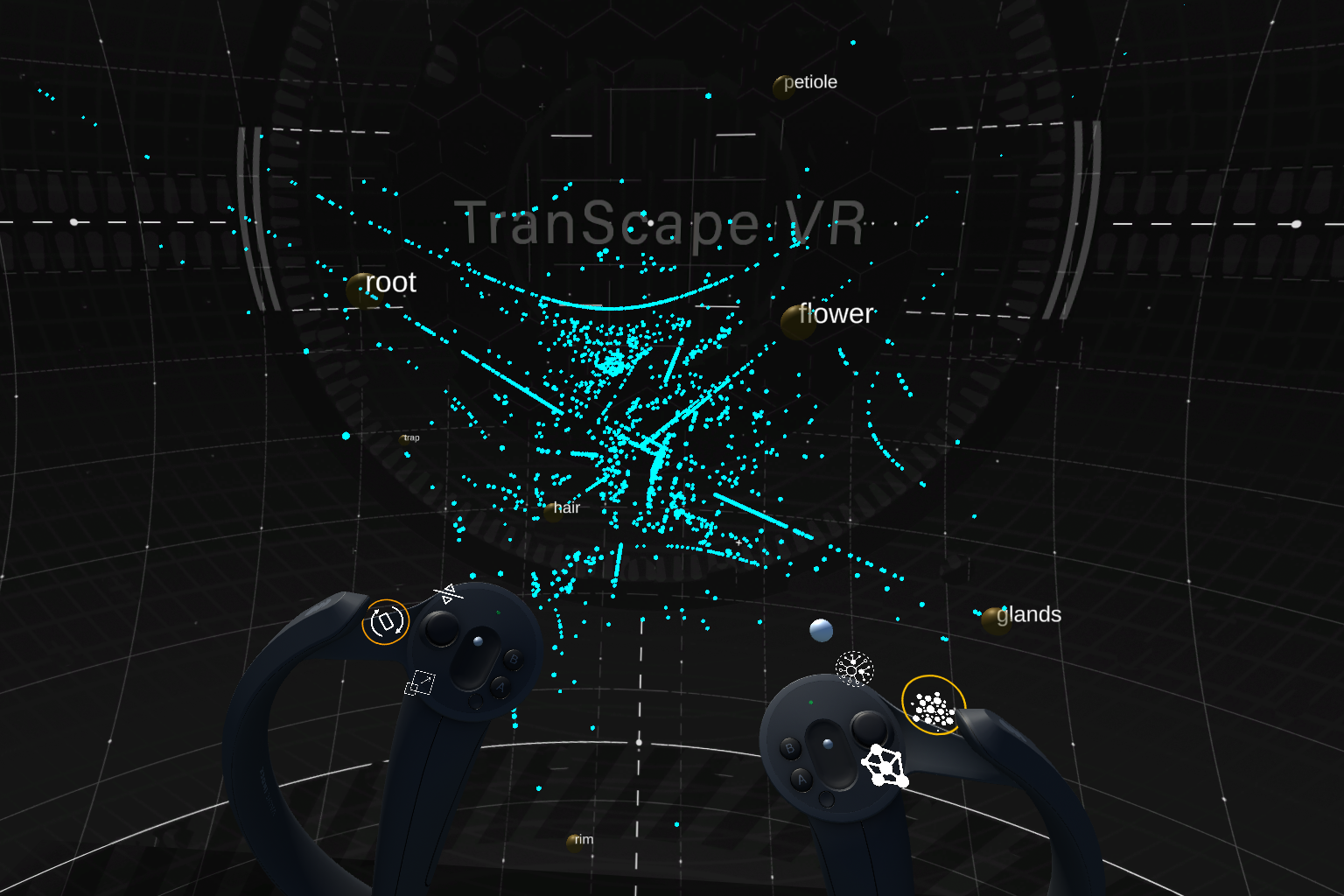
Tissues are depicted as yellow spheres, where the size is defined by the number of genes associated to them. The larger the sphere, the more genes are hosted by that tissue. Genes are shown as a blue point cloud. They are mapped by specificity, i.e. genes that are closer to a tissue node are more specific to that certain tissue. Detailed information on each gene (specificity level, expression level, annotation) can be activated by clicking on the gene.

Researchers can explore the tissue network, in which the links between two tissues are defined by the number of shared genes. The more genes are shared by a pair of tissues, the thicker the lines.
We immediately recognize the thick line between root and flower as well as between petiole and rim. This observation is confirmed by a standard Principle Component Analysis as well as Pearson correlation analysis.

In the gene network mode, the links between genes and tissues provide a clear view of which genes belong to which tissue. Genes are connected to each of their host tissues by color-coded lines. Thus, the number of links connected to a gene represent the number of tissues that host it.
One can activate links to all tissues at once or activate only links to selected tissues. This allows for investigation of shared genes between tissues as well as the specificity distribution in more detail.

The user can visually explore and analyse the multidimensional dataset by re-scaling, interacting, retrieving genes’ descriptions as well as filtering or highlighting genes based on keywords.
- Scale, rotate and move the gene cluster for different (over) views
- Rearrange tissue nodes to investigate different mapping constellations in real-time (e.g., panel D)
- Activate tissue links to find associated genes and activate gene details for quantitative data and description (e.g., panels A, B)
- Filter parameters (e.g., expression level, specificity level) to define which genes are displayed and search for (groups of) genes using keywords (e.g, panel C)
